
Lynk & Co
Car sharing and connectivity, made simple
Grubhub for Business
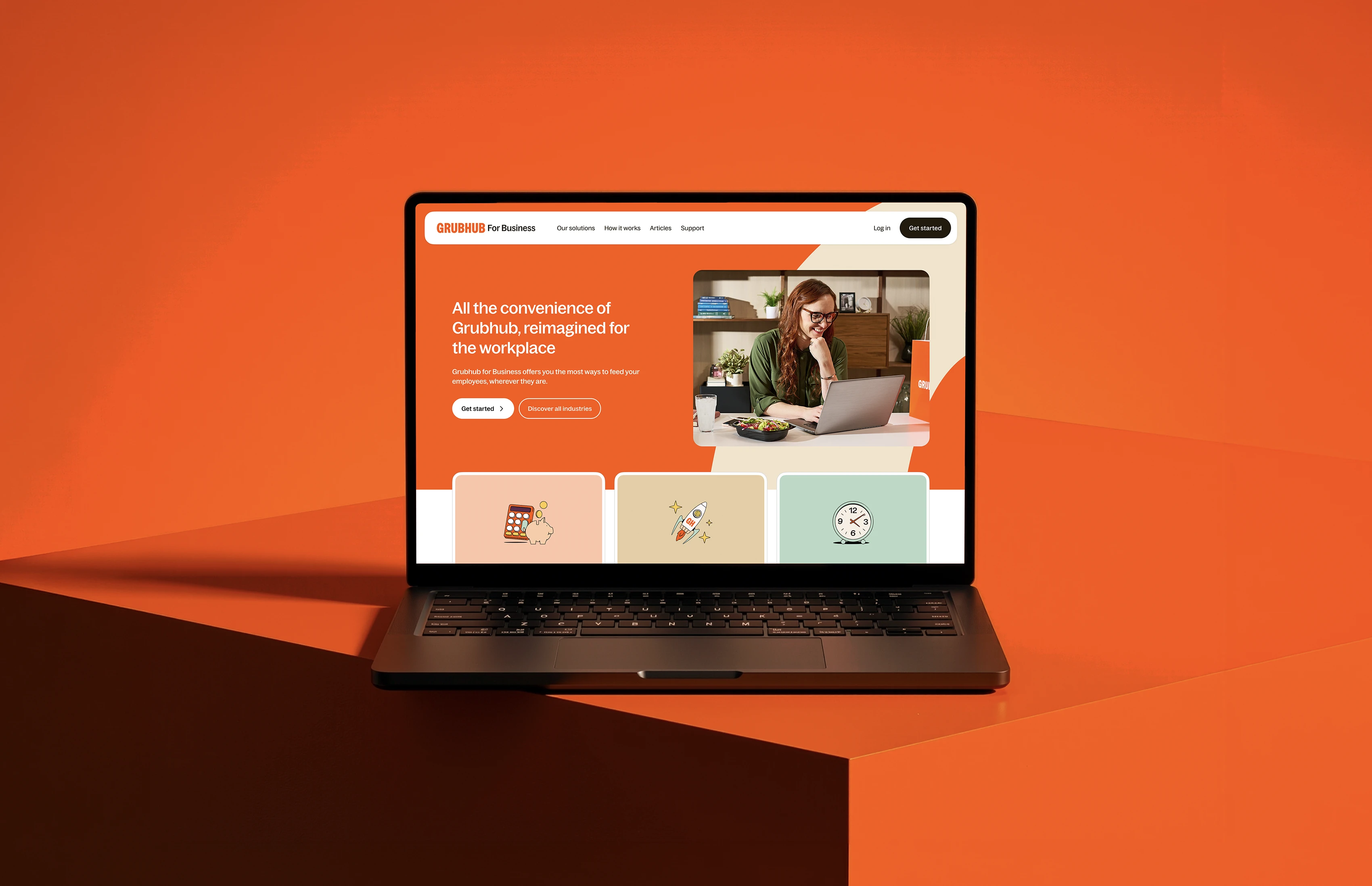
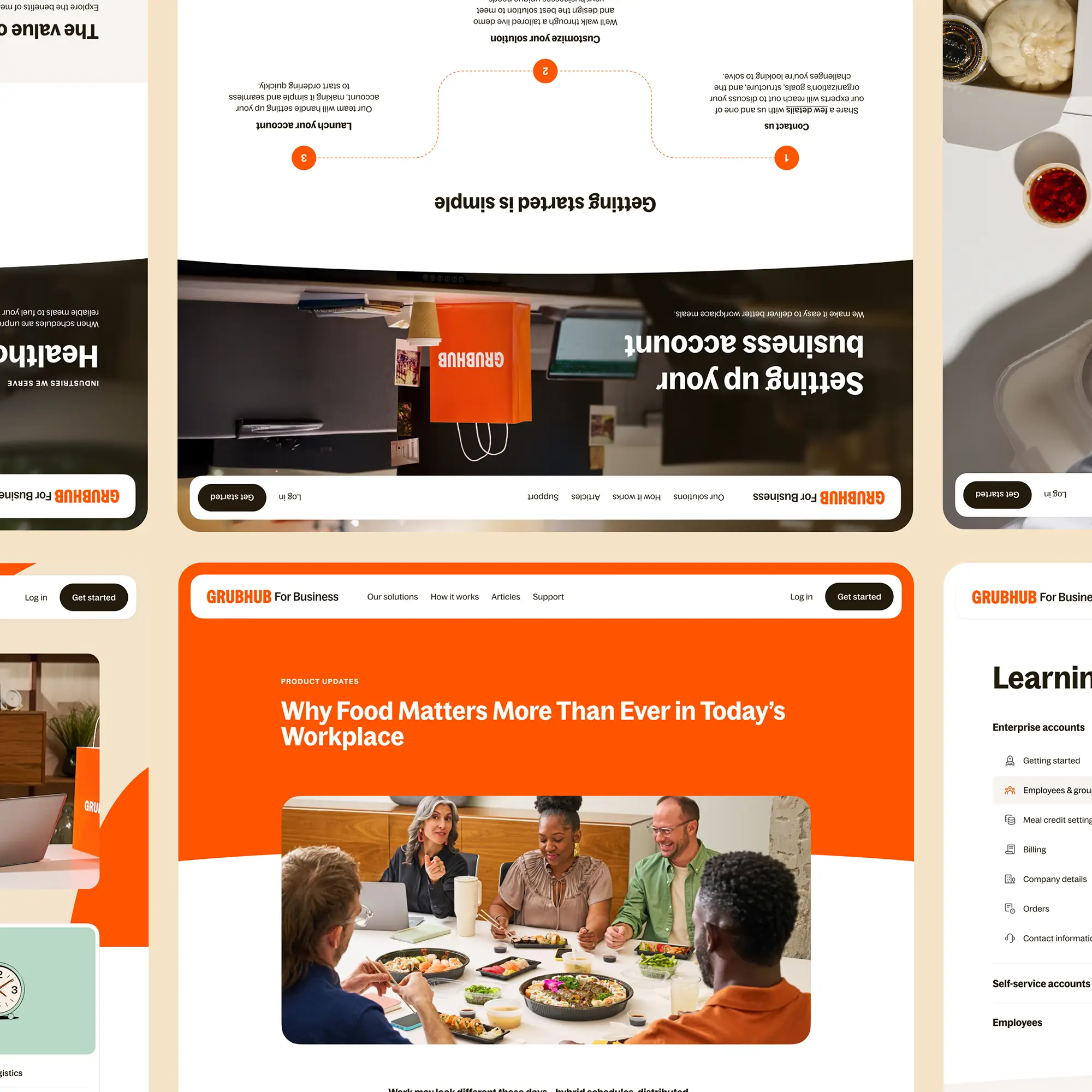
Grubhub, the US food-delivery platform, also serves businesses, from office lunches to full-service catering. But that offering had splintered across multiple brands. It was unified under a single brand in 10 weeks.
Brief
The brief was a long-term vision: one Grubhub for Business brand across every B2B touchpoint. Work began with rebuilding Corporate Accounts on business.grubhub.com, creating the foundation for a unified platform.
Stakeholder interviews and audits uncovered a fragmented experience: product-first messaging, inconsistent branding, and contact flows that generated poor-quality leads.


Discovery
Discovery ran across five departments: corporate, marketing, onsite, product, and SEO. Five interviews with nine stakeholders revealed a shared ambition, position Grubhub as a partner in daily operations, not a list of features.
In parallel, both sites were audited across three tracks: information architecture, UI/UX, and content. Sitemaps, component mapping, and page mapping exposed the overlap. Eight competing Solutions pages, two diverging design languages, and forms that asked for contact before offering context.
001
More sessions than the previous site over the same 59-day period.
002
Increase in active users compared to the previous site.
003
Higher event activity per active user, suggesting deeper engagement.
004
From initial discovery to a fully launched platform.
What we Solved
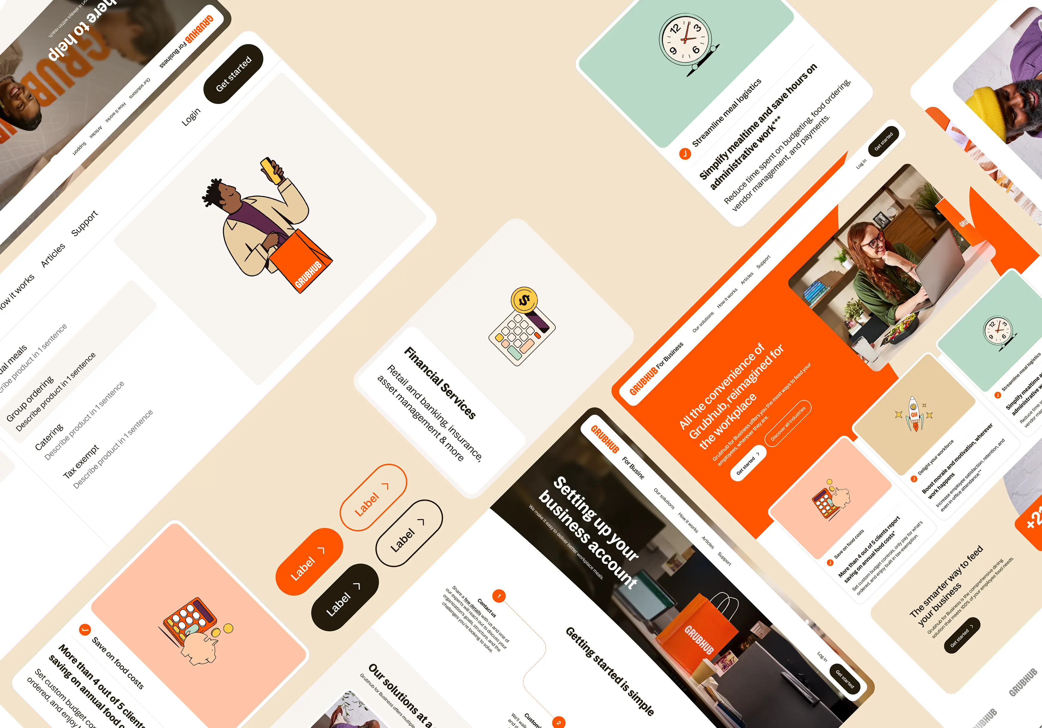
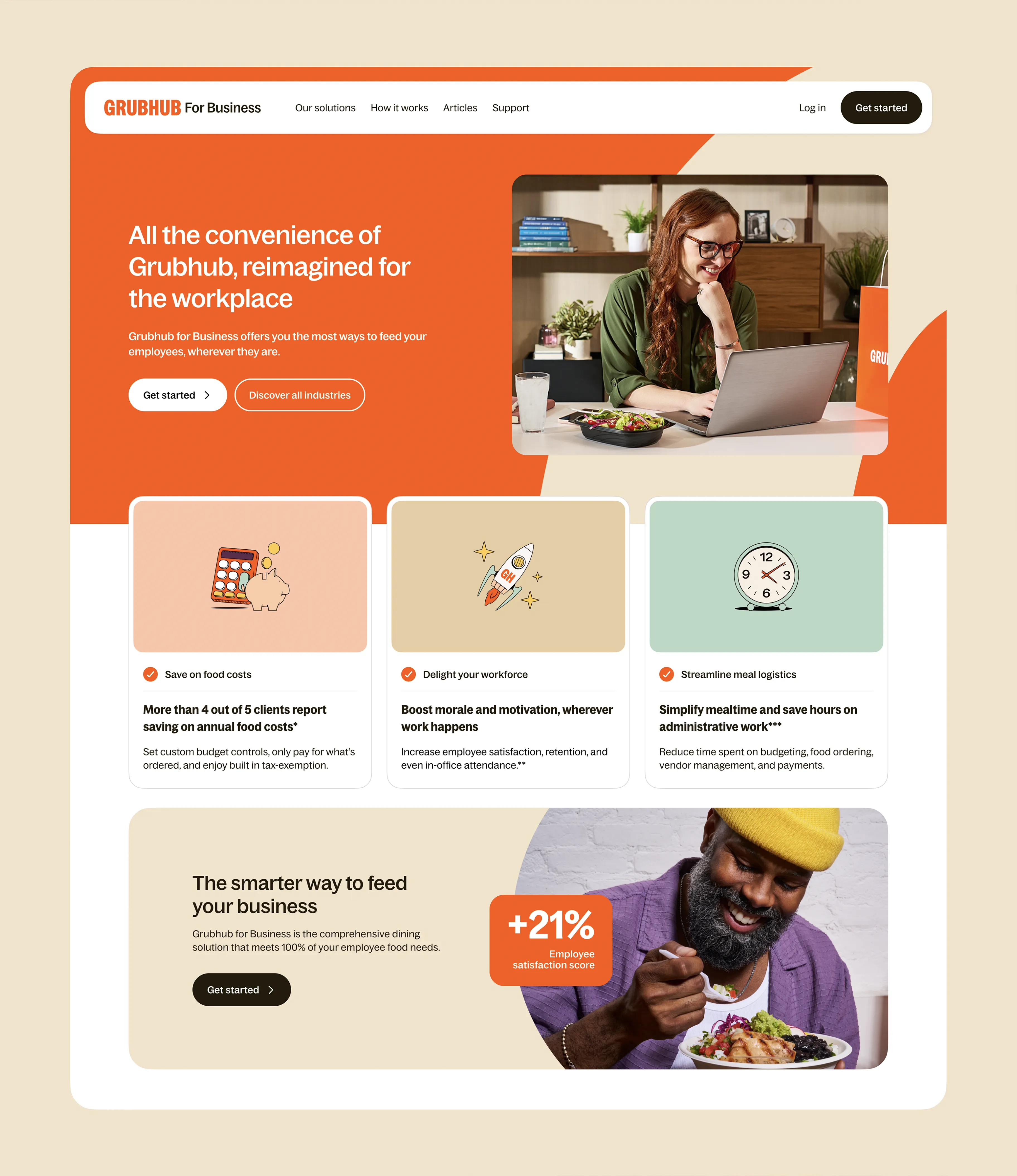
The goal was to reposition Grubhub for Business around partnership value rather than product features, alongside a scalable design system and flexible page templates, giving every future B2B property a consistent foundation instead of launching on separate domains.
The old sites were feature-first, with eight overlapping Solutions pages between them. Those were consolidated into four, with the information architecture rebuilt around industries, teams, and products, with a clear path from first visit to conversion.
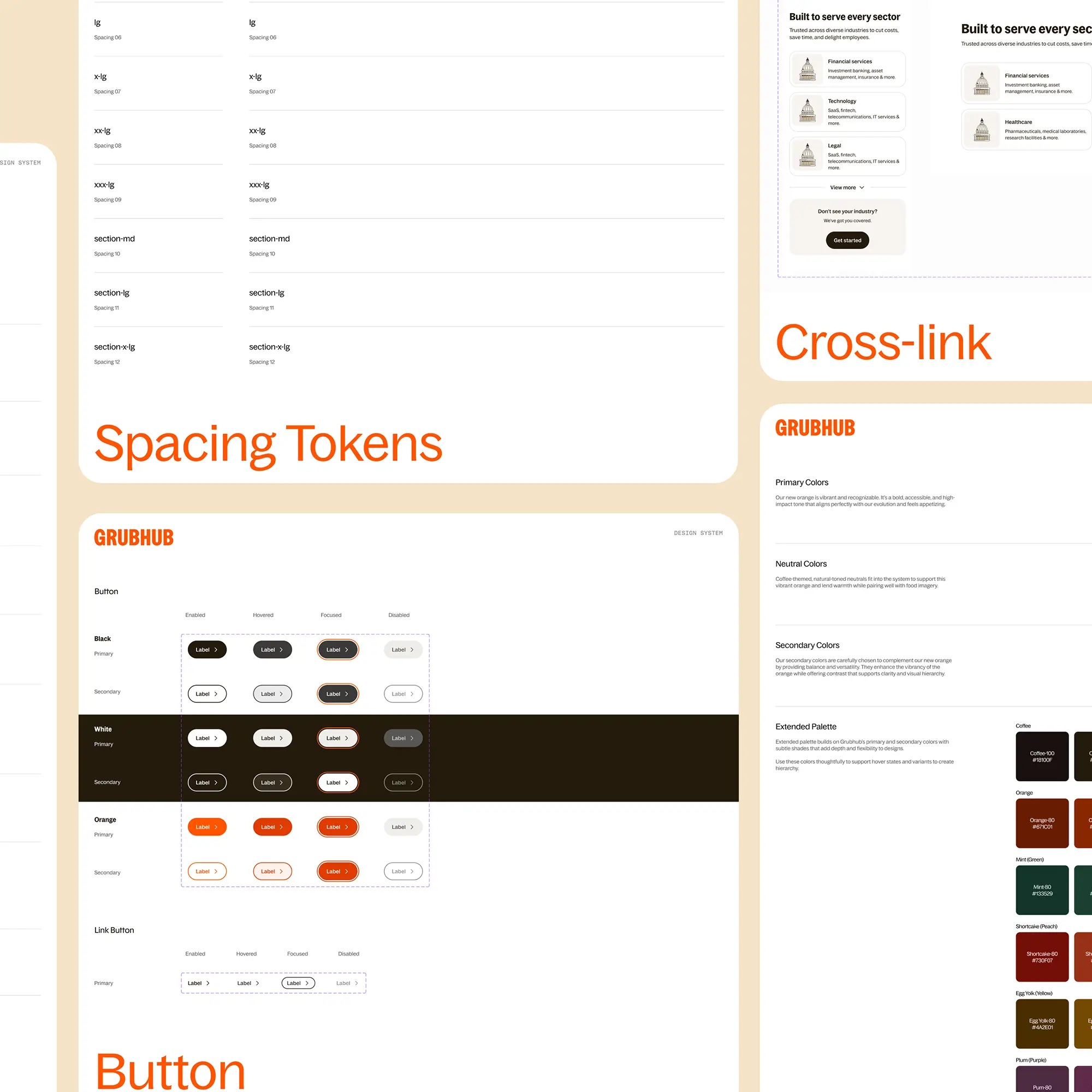
The existing business sites felt like different brands. A unified visual language had to change that, aligned with Grubhub's brand Cookbook. From typography and responsive layouts to reusable section components, everything internal teams need to launch future properties quickly and consistently was put in place.
The previous site was static and purely functional. Motion was introduced to clarify hierarchy, improve wayfinding, and bring warmth to the brand. It begins with navigation, where helping visitors orient themselves matters most. A cohesive motion system ensures every interaction follows the same principles, creating a more consistent and refined experience.
Contact forms sat on high-traffic pages before any value story, collecting leads who didn't know what they were asking for. Conversion was placed after context, with calls to action that speak to each audience. Designed so the people who reach the form arrive informed.
Navigation
The old corporate site spoke to product managers, not the finance and HR leaders actually buying Grubhub for Business.
Navigation was rebuilt around how decision-makers evaluate a partnership: the industries Grubhub serves, the teams it supports, and the products on offer. Individual ordering, group ordering, catering, and tax-exempt ordering. One structure. One path from first visit to conversion.
Explore more work